Wireframes are the soul and essence of every feature, project, and product in design. They provide a basic layout that helps product teams understand ideas and the solutions they offer, while keeping the focus on user experience and business goals.
Using high-quality wireframe examples can do more than inspire more detailed designs later on. They can also help uncover opportunities for improvement, clarify concepts and ideas, and speed up concept validation and the overall workflow.
With the help of new AI design tools like Magic Patterns, you can quickly generate low- to mid-fidelity interactive wireframes that help you test new ideas, visualize information hierarchy, and move from concept to design faster.
10 Wireframe Examples For Web And Mobile Apps
Here's a list of 10 practical wireframe examples generated by Magic Patterns. You can use them for inspiration or to adjust them based on what you're looking for.
1. E-commerce Product Page Wireframe
View example
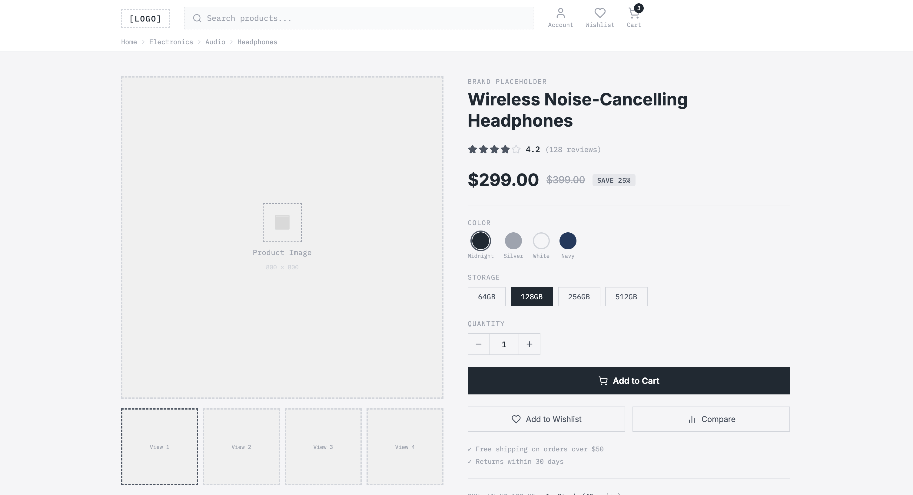
A strong e-commerce product page should guide users from product discovery to purchase with minimal effort. This fully customizable template shows the layout of a product page that includes essential components such as:
- Header and global navigation: Keeps the user oriented in the online store, including the logo, search bar, user account icon, wishlist icon, shopping cart, and navigation path.
- Product image gallery: Including a visually attractive main product image, carousel, zoom, and full-screen options.
- Product summary: Allows you to quickly visualize price, color alternatives, sizes, or storage options, and a rating score. It answers the basic questions you may have during the decision-making process.
- Product details: Further down the page, more details and technical specifications, as well as detailed reviews and related products.
2. Mobile App Onboarding Flow Wireframe
View example
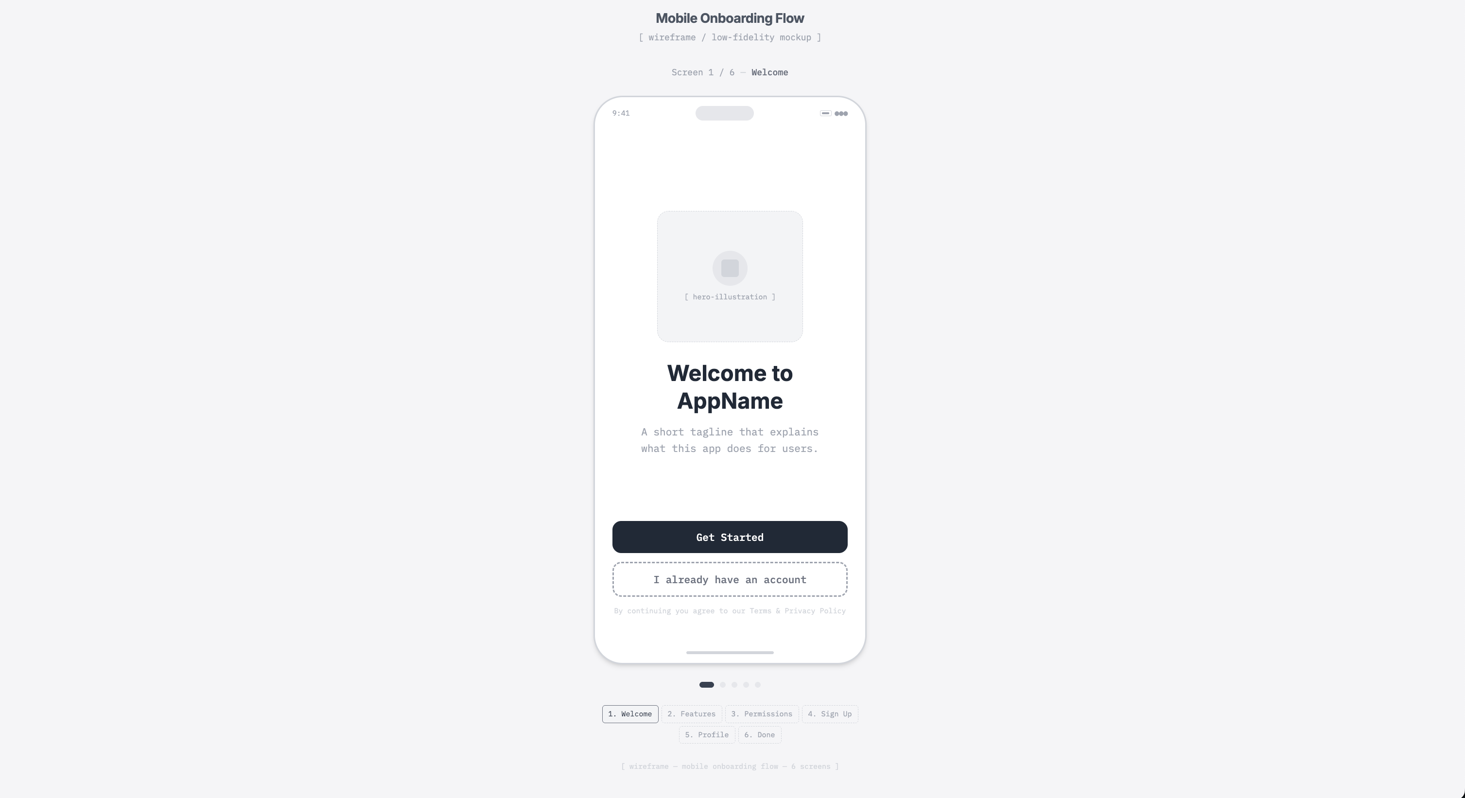
Your onboarding flow wireframe should outline the sequence of screens your user will see on their mobile phone. It should present minimal and relevant information, clear key actions, and smooth navigation. Our template includes:
- Welcome screen: A hero illustration, a primary headline and short description, a primary CTA "Get Started," and a secondary action.
- Feature screen: The title and short explanatory copy, feature boxes with images and brief descriptions, and the navigation controls "Continue" and "Back."
- Permissions screen: Explains why the listed permissions are needed, with icons and toggle switches so that users can turn settings on and off.
- Sign-up screen: A create-account section with input fields, in this case, email and passwords, and a login alternative button.
- Profile screen: Has a placeholder circle where users can upload a profile photo, text fields for name and username, a selection area for identity type, and a "Save profile" CTA.
- Done screen: The final layout includes a success icon, a confirmation message showing the steps completed, and a "Go to dashboard" CTA.
3. Landing Page Wireframe
View example
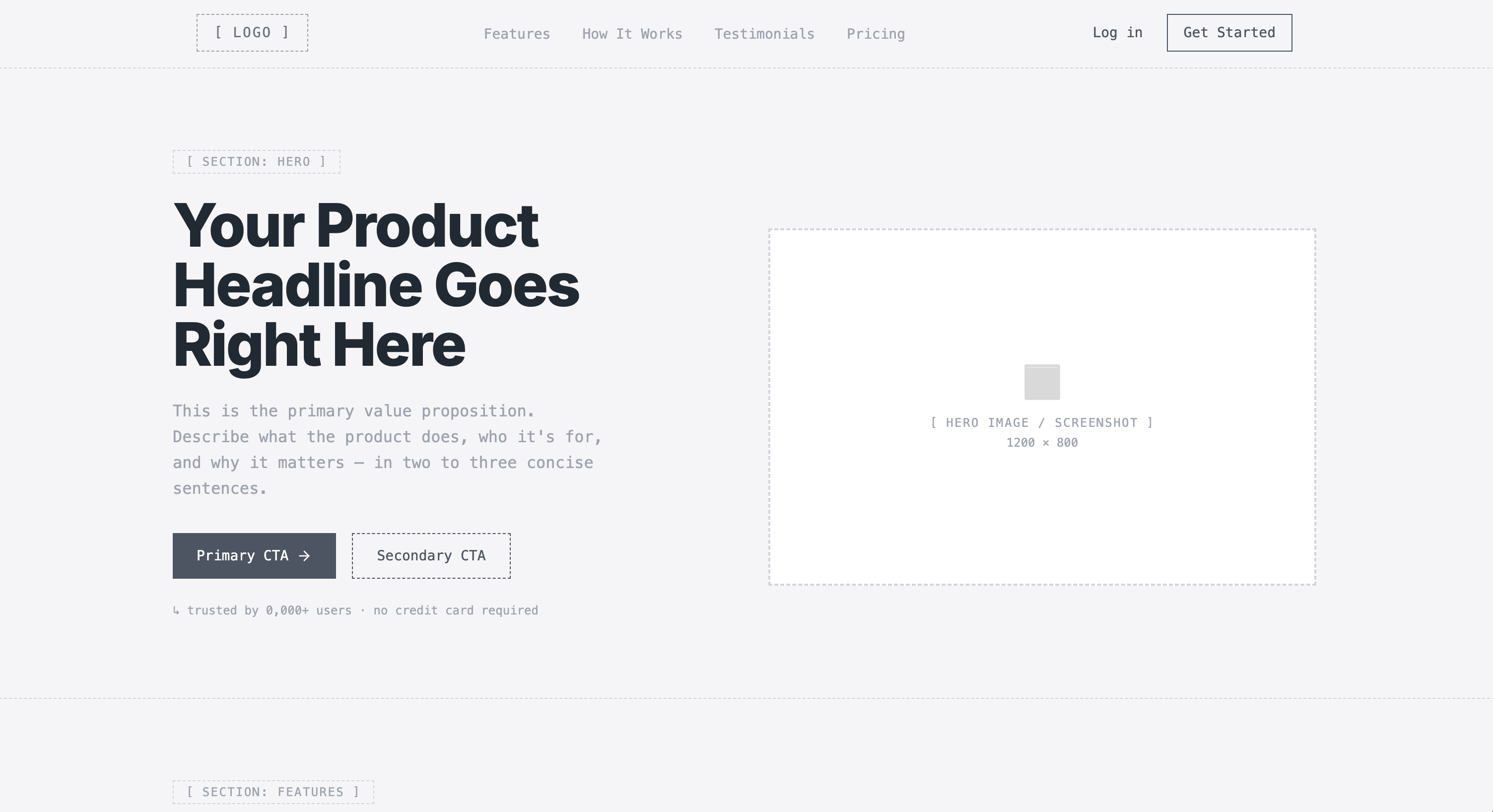
If you need a useful reference for a landing page that showcases your product or business's most attractive features, here's a great wireframe example that includes:
- Header navigation: Features the logo, navigation links, and secondary actions.
- Hero section: With a headline, a supporting subheadline, a primary call-to-action button, an optional secondary CTA, and a hero image.
- Key features: A section headline introducing product benefits, followed by feature cards with icons and short descriptions.
- How it works section: A simple product demo that explains the flow in three steps.
- Testimonial section: Customer testimonials that reinforce credibility.
- Pricing area: Three plans, including a highlighted popular option with a clear CTA and a basic comparison.
4. SaaS pricing layout
View example
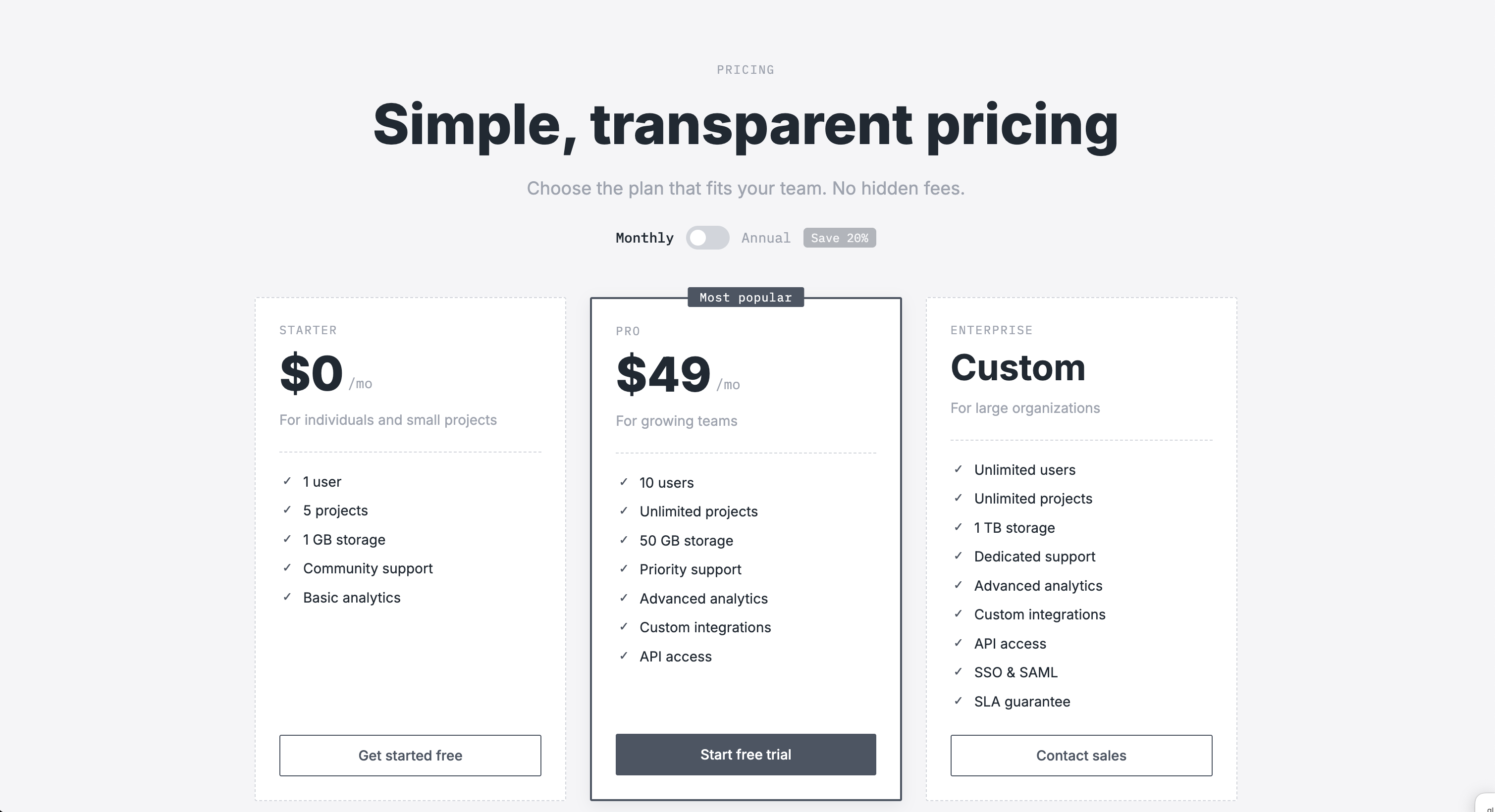
A strong SaaS pricing layout should drive conversion and communicate value clearly. If you are looking for the best wireframe examples for this page, check out our template. It includes:
- Pricing hero section: With a clear page title, short supporting description, monthly and annual billing toggle, and the promotional value message "Save 20% annually."
- Pricing plans grid: Three pricing cards, with plan names, pricing, short descriptions, feature highlights, and a clear CTA.
- FAQ section: Expandable accordion questions with answers to common concerns and additional details about the service.
- Contact section: A simple support area including a "Contact us" button.
5. Blog Post page
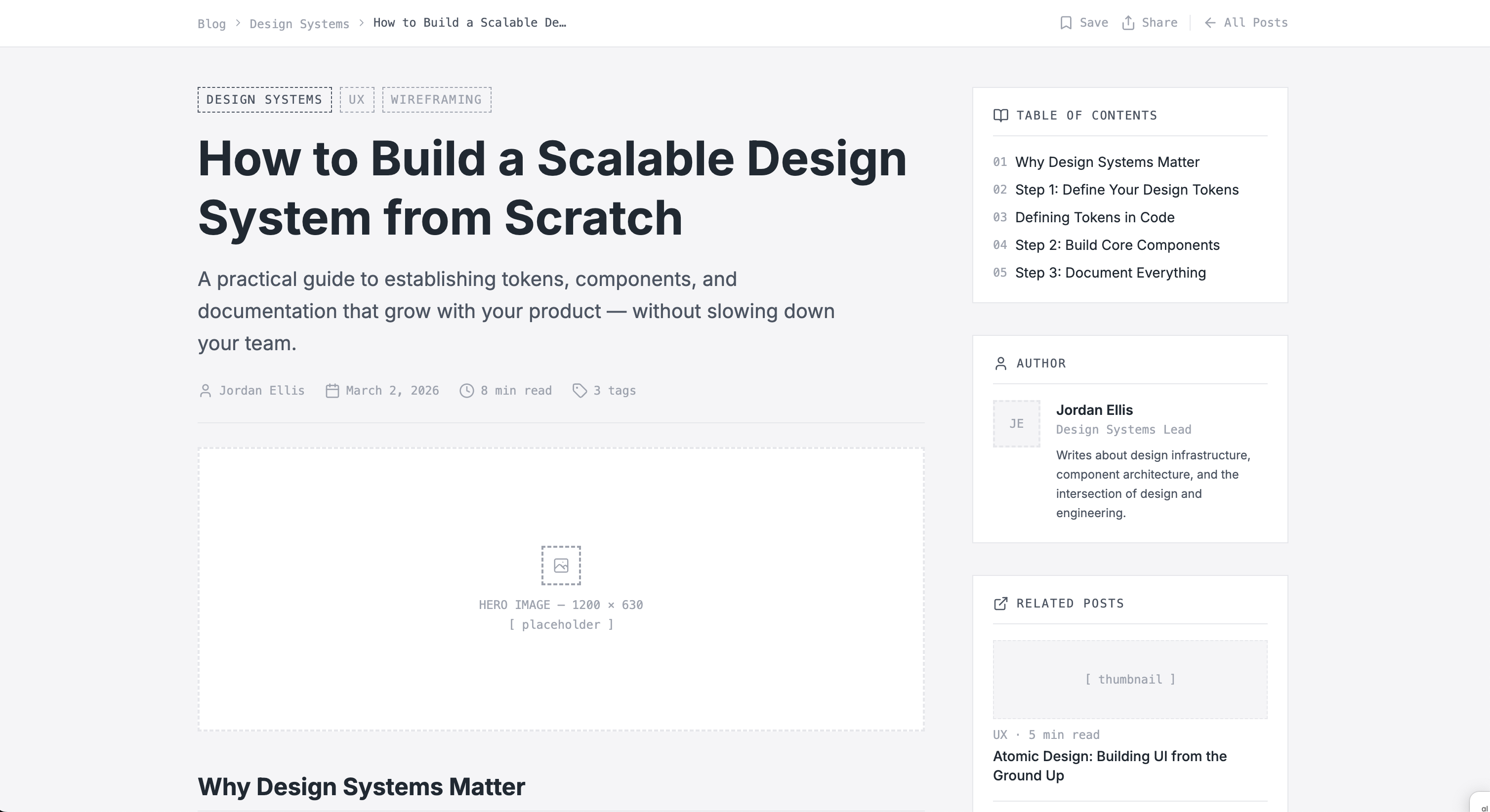
View example
A strong blog post page should provide a clear, user-friendly navigation that helps readers engage with the content while understanding the brand context. In this AI-generated wireframe, you'll find the core elements:
- Article hero section: An H1 title, a short subtitle, author information, publication date, reading time, and a featured cover image.
- Article content area: Structured text blocks with subheadings, highlighted insights and quotes, and lists that make the content easier to scan.
- Sidebar: On the right side, a secondary content area with a table of contents, an author bio, related posts, and a newsletter signup module.
6. Social media mobile app
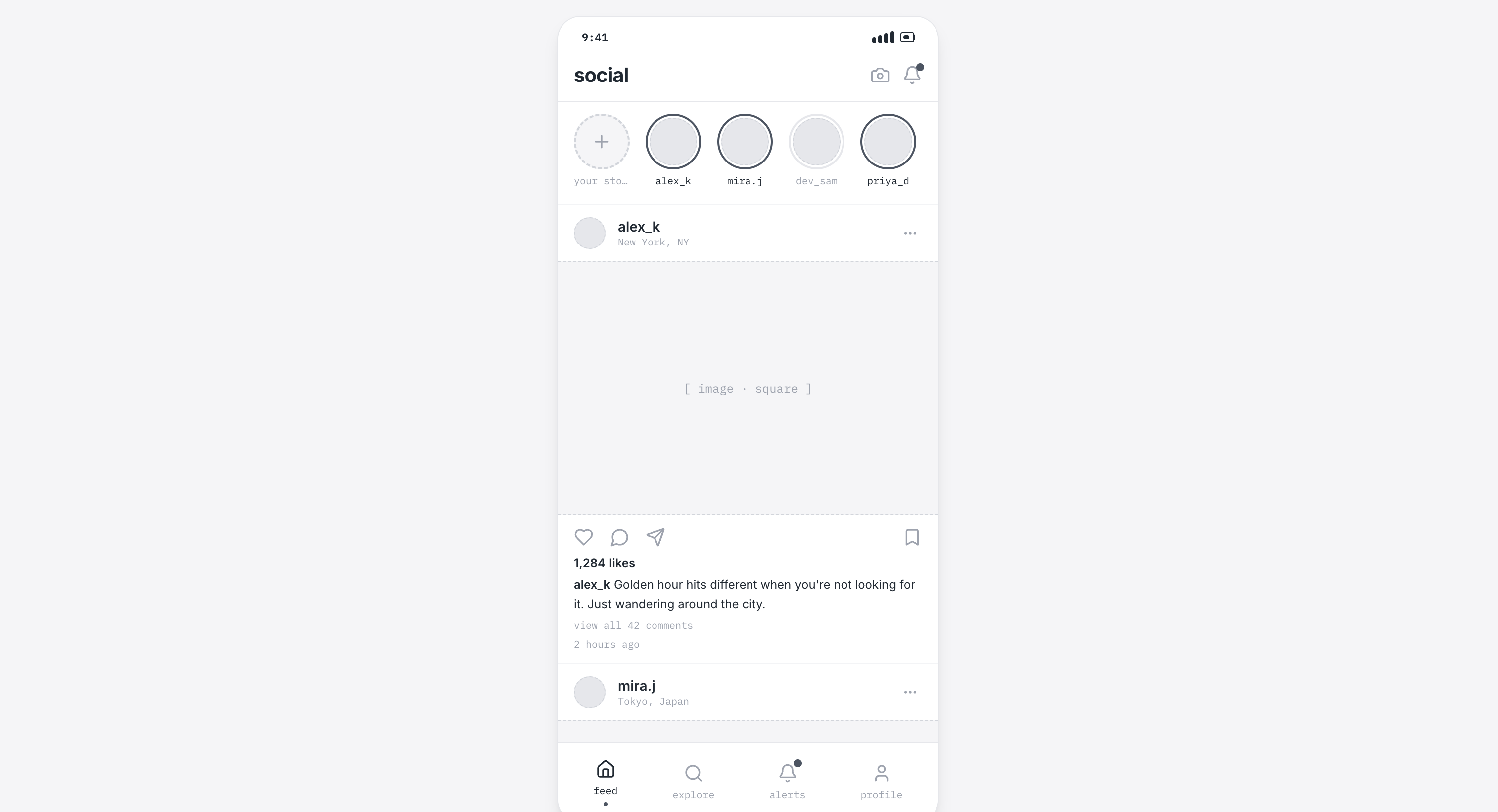
View example
For a social media app wireframe, you'll need all core interactions that support a seamless user experience. Magic Patterns' social media app template includes:
- Top navigation header: Displays the app name, along with camera and notifications icons.
- Stories carousel: Horizontally scrollable avatars where users can share recent events.
- Main feed: Vertical postcards including user avatar, name, and location, a square image, and interactive engagement actions like comment and share.
- Bottom navigation bar: Includes icons for Home, Explore, Alerts, and Profile, which take users to those sections.
7. Checkout Flow Wireframe on mobile
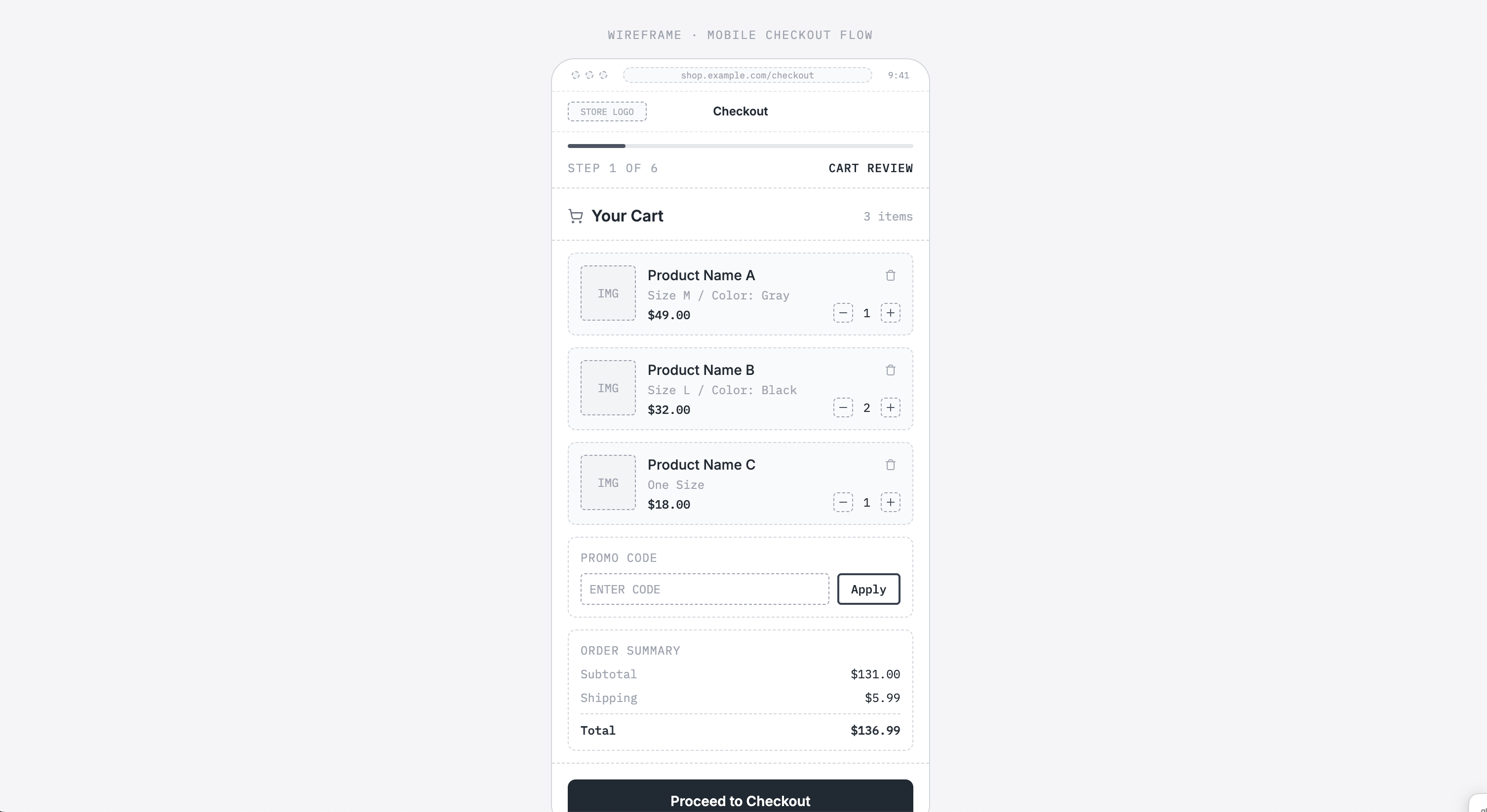
View example
The checkout process should focus on clarity, speed, trust, and mobile-friendly forms. Our template includes several key elements:
- A progress bar: Placed at the top so users can see how far along they are in the process.
- Cart summary: A list of products with images, options to remove or edit items, a promo code field, and a clear CTA.
- Shipping information: Contact information fields, an address form, and delivery options.
- Shipping method: A list of delivery options with price and ETA, selectable radio buttons, and shipping cost.
- Payment details: A payment method selector, card input fields, security indicators, the order total, and a purchase CTA.
- Order review: A confirmation screen with a complete summary of the order, including contact, delivery, and pricing details.
8. Dashboard / Analytics Overview
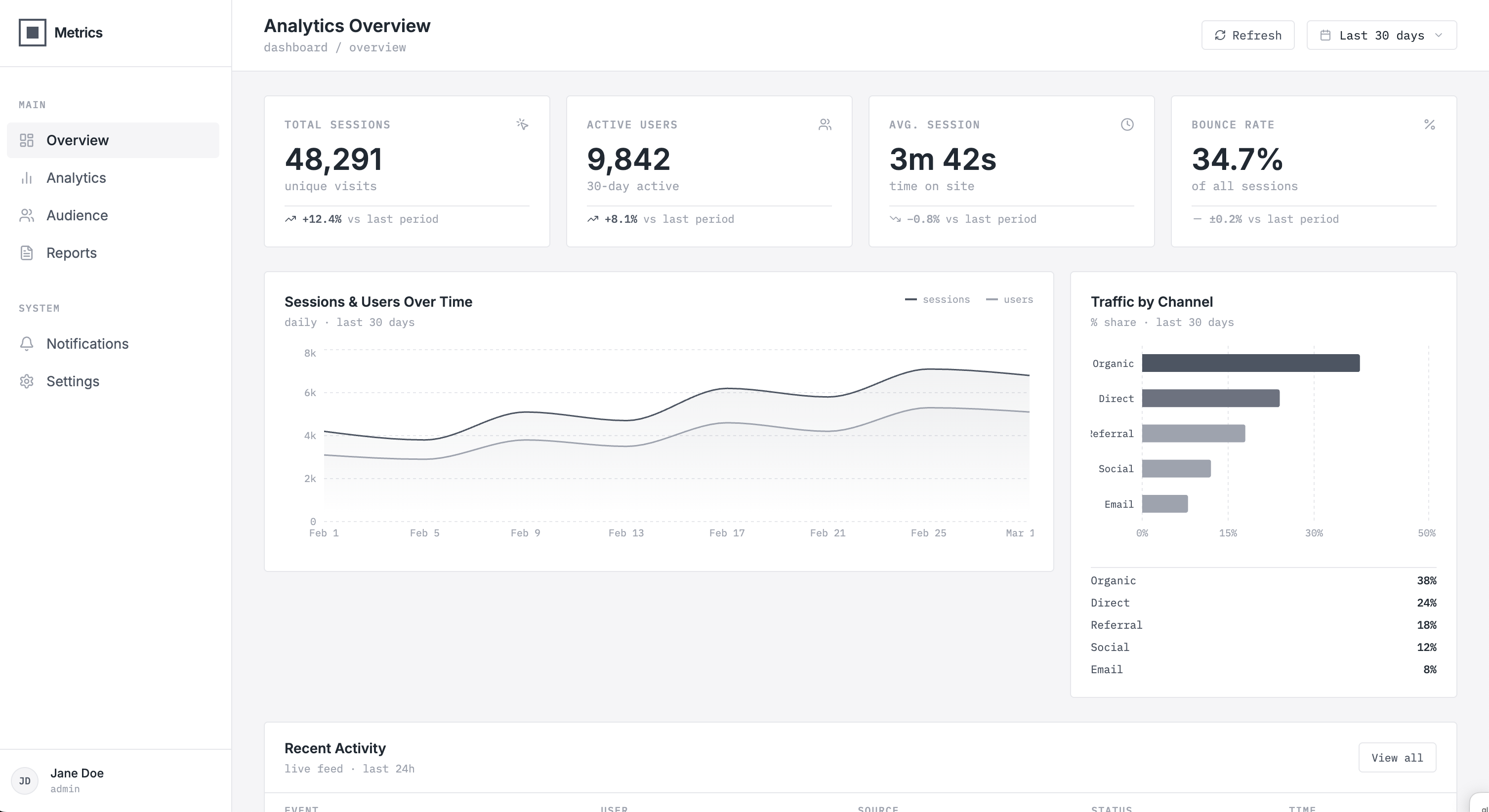
View example
Your analytics overview dashboard wireframe should include key metrics like top-level stats, engagement rates, or revenue, as well as graphics and charts that explain trends and performance. Here's what our wireframe example includes:
- Navigation header: The dashboard title, date range, and refresh button.
- Sidebar navigation: Menu items for different reports and icon labels.
- Metric Summary Cards: KPI cards and an at-a-glance overview of performance, along with trend indicators.
- Data visualization section: Line charts that show performance over time and comparison charts for categories or segments.
- Data table: With rows and columns of metrics and sortable columns that complement the charts.
9. Search Results Page
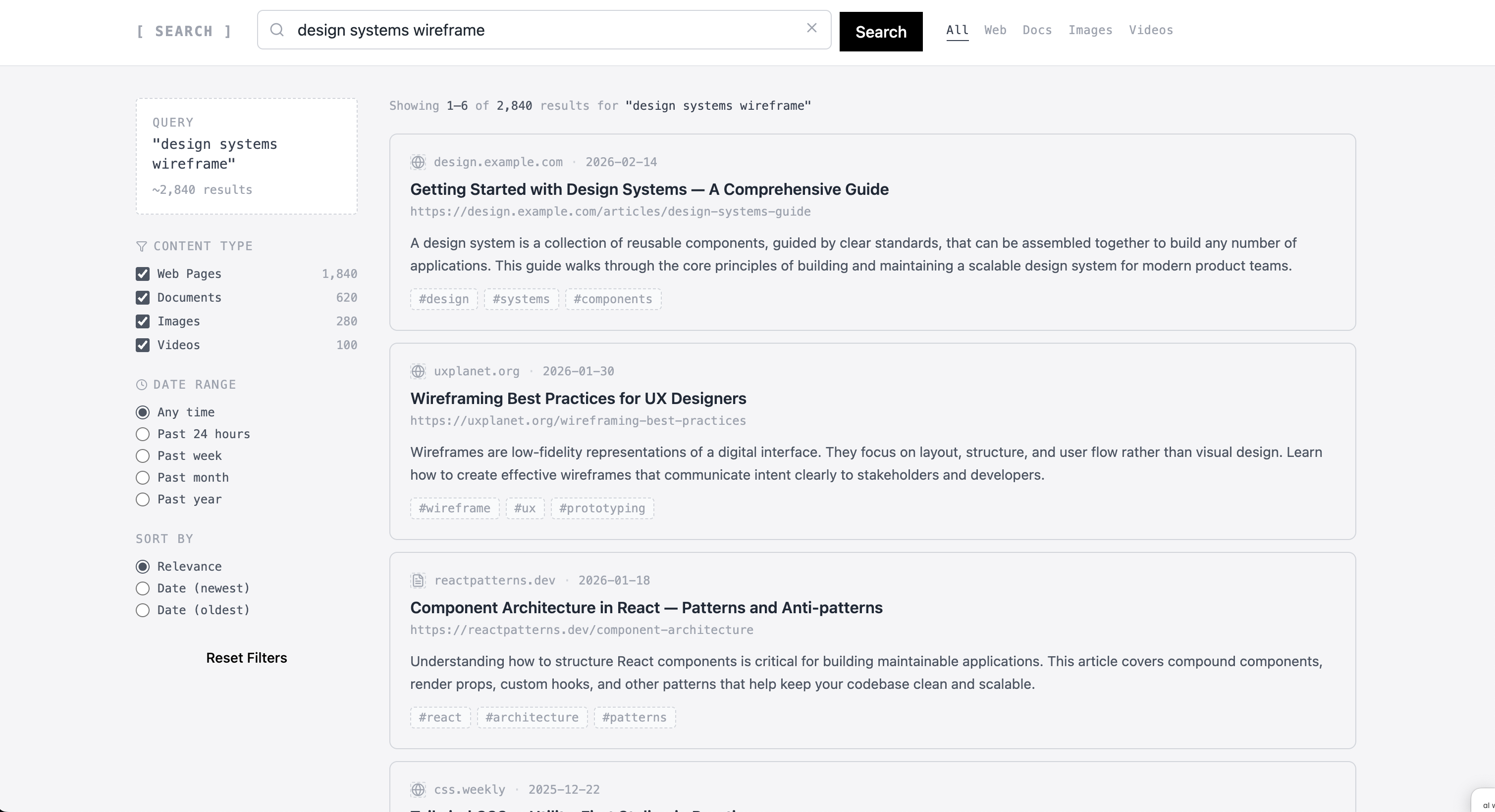
View example
If you want to build the next trendy search engine, you can use our template. It includes all key elements that any search page should have:
- Header and search bar: A component for your logo or brand name, a search bar with an input field, and a "Search" button. On the top right, additional navigation options such as Web, Docs, and Images.
- Filters: Category, checkboxes, and sorting options to refine results by topic, content type, and date range.
- Result list: Cards that include titles, short descriptions, thumbnail images, and metadata.
- Pagination controls: Page numbers and navigation options to explore more or previous results.
10. Login/Registration Page Wireframe
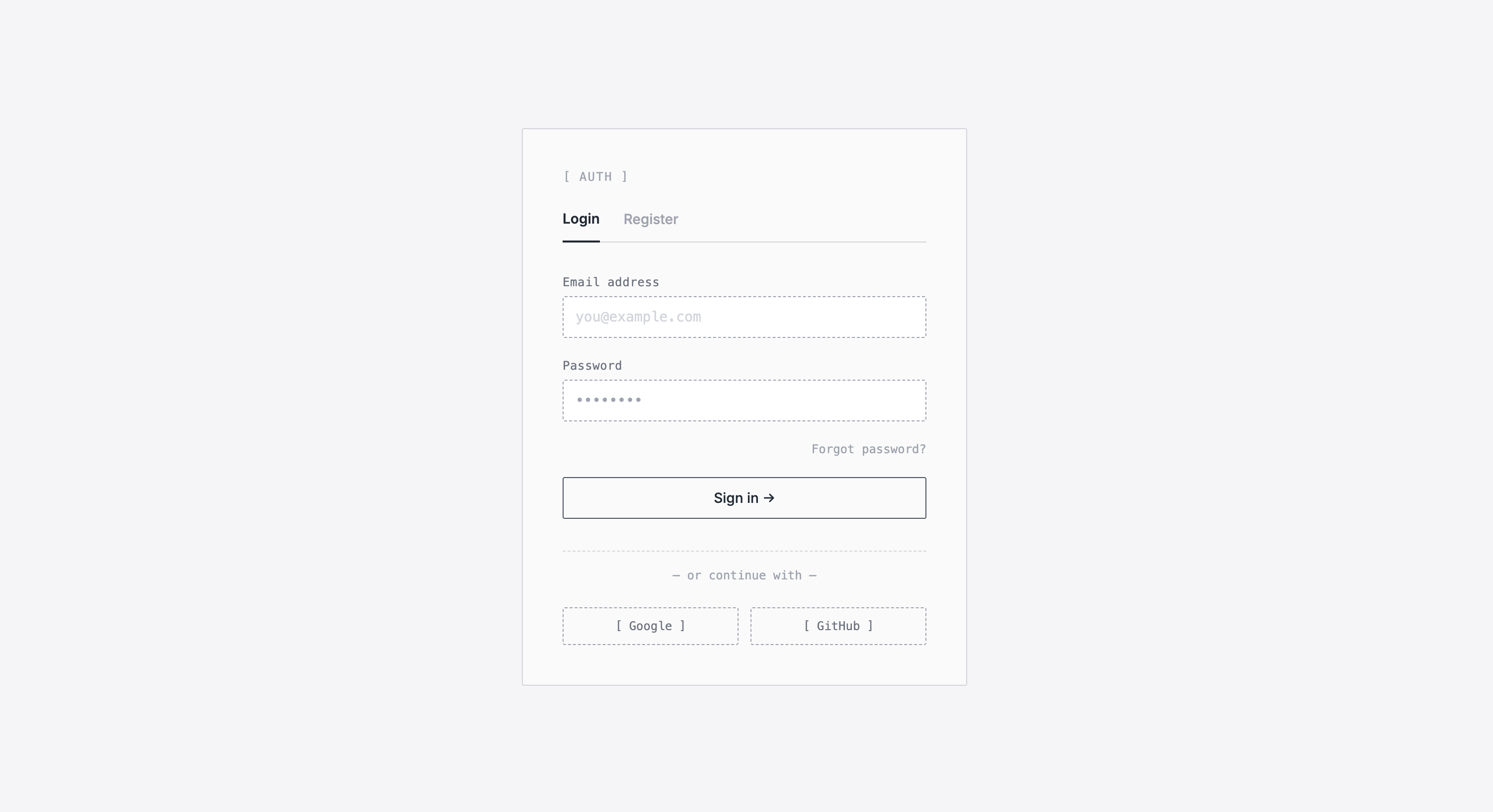
View example
A log-in registration page wireframe should be straightforward. Here are the key elements included in our template:
- Authentication card: A central area that lets users switch between the Login and Register forms.
- Login form: Includes email and password input fields, a "Forgot password?" link, and a primary "Sign in" CTA button.
- Registration form: Shows user information, password, and confirm password fields, and a primary "Sign up" CTA button.
- Social authentication options: A section that offers faster login alternatives, including third-party sign-in buttons.
Build the best version of your product.