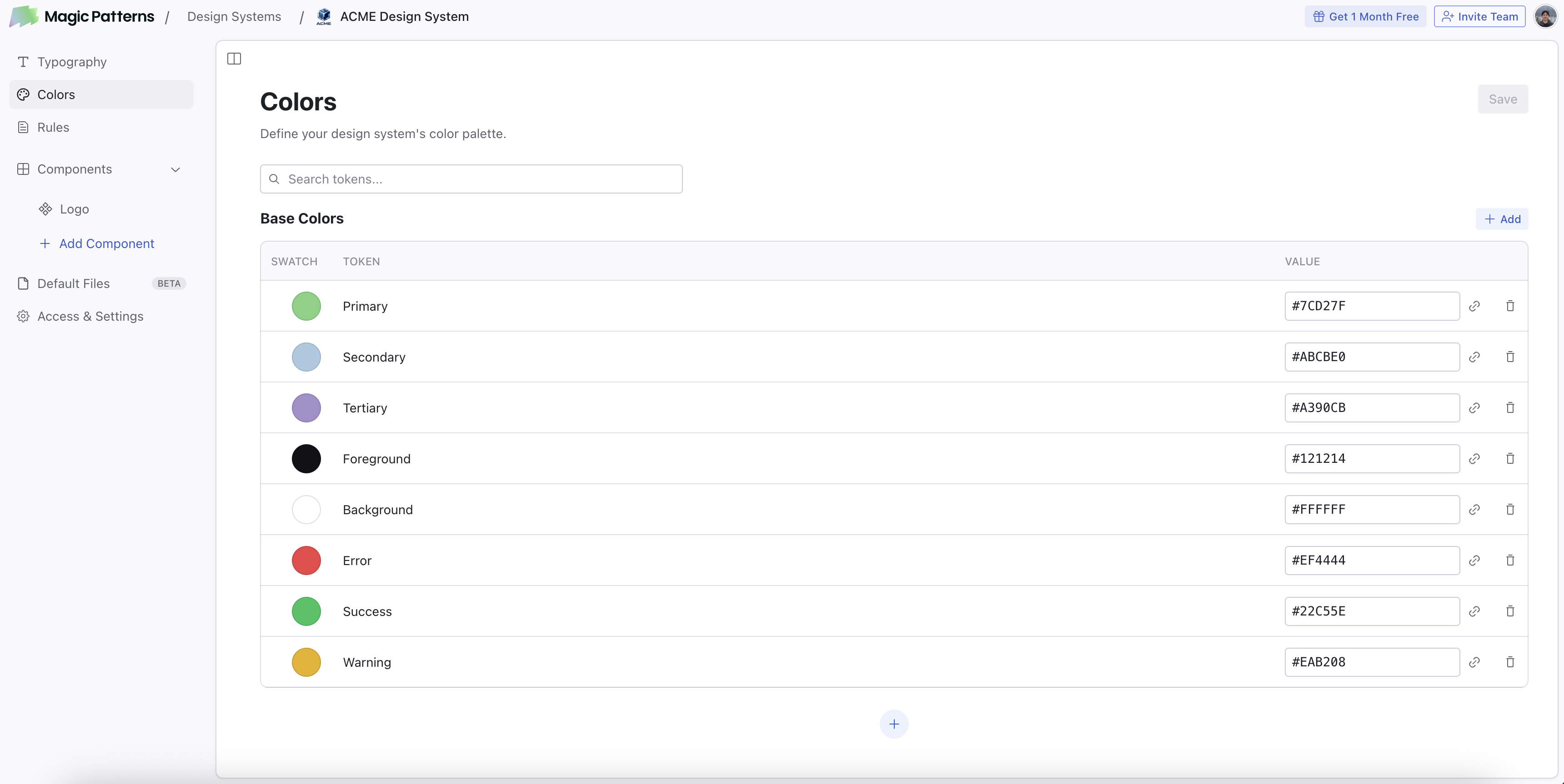
Why set up colors?
Consistent AI Generation
When you generate a design or component with a Design System that has colors set up, the AI will use your palette in the generated code. This means your colors end up in every new design without having to specify them in every prompt.Visual Edit
When you select an element in Visual Edit, the color picker shows a “Design System” section with your defined colors. This lets you apply colors from your palette directly to any element.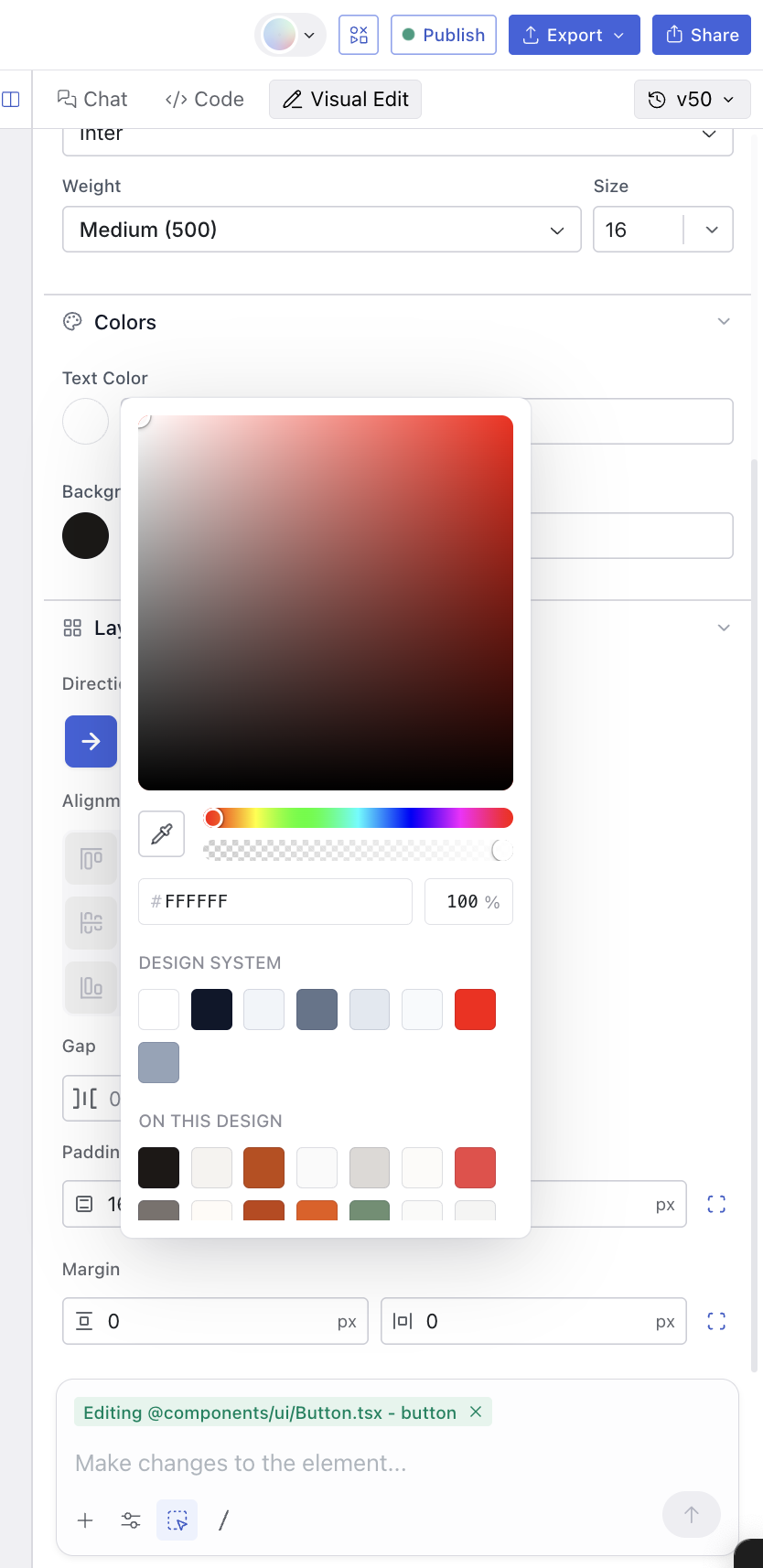
Importing Colors
You can bulk-import color tokens into your Design System from a.csv file or a Figma .json variable export. This is the fastest way to bring an existing palette into Magic Patterns without manually adding each color.
Importing from CSV
Your CSV file should have two columns: a token name and a color value. The first row can be a header or you can start with data directly. Accepted header names for the name column:name, key, token, variable.
Accepted header names for the value column: value, color, hex, code.
Color values can be hex (#FF0000), rgb (rgb(255, 0, 0)), or hsl (hsl(0, 100%, 50%)).
color.blue.10 or background-primary are automatically converted to readable labels (e.g. “Color Blue 10”, “Background Primary”) during import.
Importing from Figma Variables
Follow these steps to export your color variables from Figma as a JSON file that Magic Patterns can read.Open the Variables Panel
In Figma, go to View > Panels > Toggle Variables to open the variables panel.
Export a Collection
Right-click on the collection you want to export and select Export modes. This will export all variables in that collection.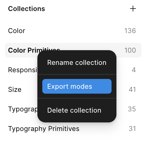
Importing into your Design System
Once you have your files ready:Tap on 'Import from File'
Go to your Design System’s Colors page and click the Import from
File button. You can find it in the empty state or next to the Add
button in the color table.
Upload your files
Drag and drop your
.csv or .json files, or click to browse. You can
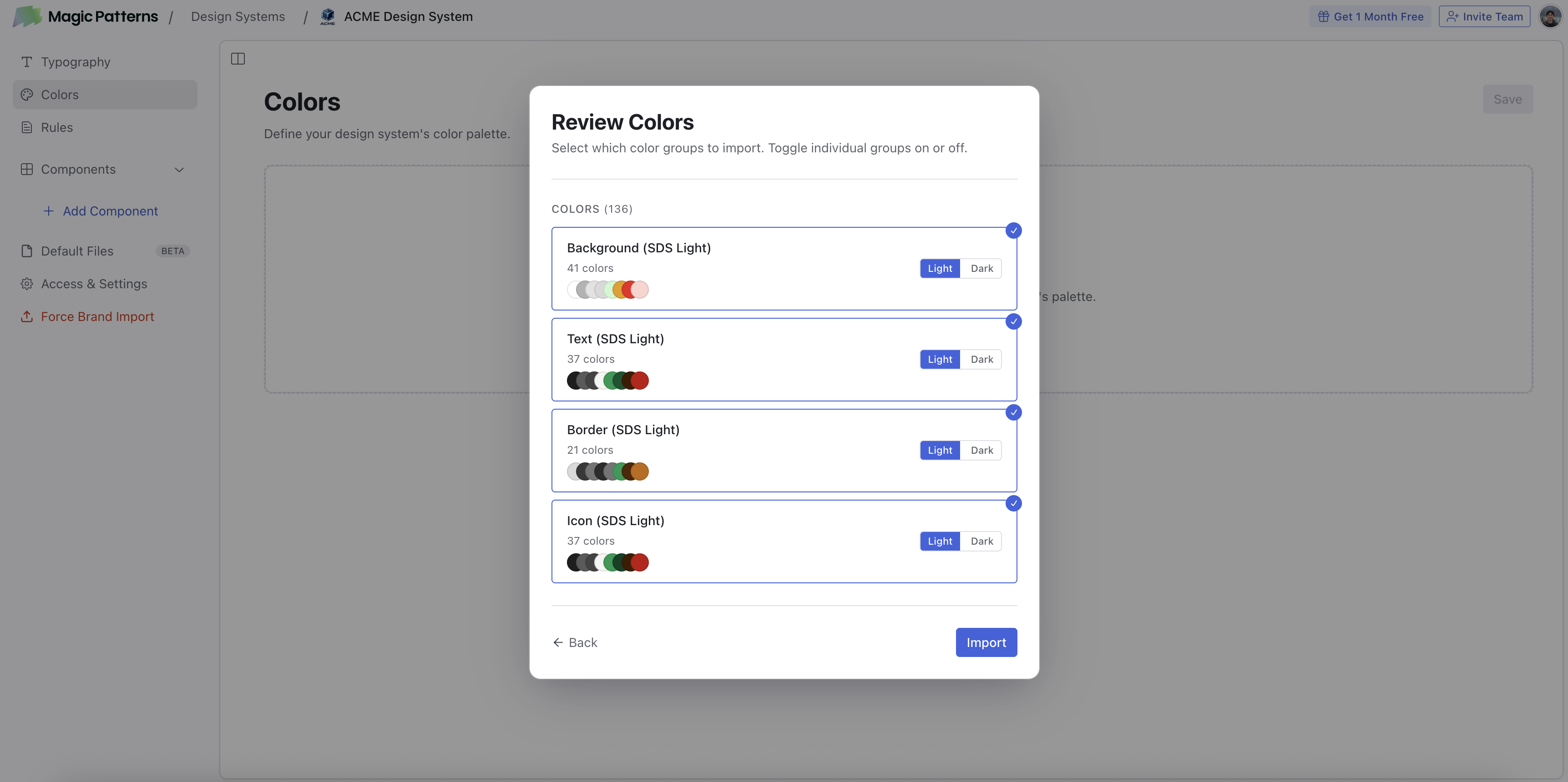
upload up to 7 files at once.Review and assign modes
Magic Patterns parses your files into color groups. For each group you can
toggle it on or off and assign it to Light or Dark mode.
What’s Next?
Rules
Define spacing, visual rules, and brand guidelines for the AI.
Typography
Manage font groups in your Design System’s Typography section.